Atomic Design Components
As Product Design Lead at uPlanner, we embarked on a transformative journey to enhance our design process by transitioning from creating bespoke user interfaces (UIs) in Adobe XD to implementing a robust component system in Figma based on Atomic Design principles. This shift was driven by the need to streamline our design workflow, improve collaboration across teams, and ensure consistency across our digital products.
Challenge
Our design team initially relied heavily on Adobe XD for UI design, producing highly customized interfaces for various projects. While this approach allowed for creative freedom, it led to several challenges:
- Inconsistency: Each interface differences in design language, leading to a fragmented user experience across our product suite.
- Inefficiency: The lack of reusable components resulted in repetitive work, as designers recreated similar elements from scratch for each project.
- Collaboration Bottlenecks: As our team grew, collaborating on design files in Adobe XD became cumbersome, with multiple versions of files and difficulty in maintaining a single source of truth.
Objective
Our goal was to transition to a more systematic approach to design that would enable consistency, scalability, and efficient collaboration. We chose to implement a component system in Figma, structured around the principles of Atomic Design. This would allow us to build a design system composed of reusable components, ensuring a cohesive user experience across all our digital products.
Process
1. Audit of Existing Designs
The first step was to conduct a comprehensive audit of our existing UIs designed in Adobe XD. We identified common patterns, recurring components, and unique design elements across different projects. This audit helped us understand the scope of work required to transition to a component-based design system.
2. Building the Design System in Figma
With the audit completed and the team aligned on Atomic Design principles, we began building our design system in Figma:
- Atoms: We created a library of fundamental components like buttons, color styles, text styles, icons, and input fields. Each atom was designed with flexibility in mind, allowing for variations in size, color, and state.
- Molecules: Using the atoms, we developed more complex UI components such as form fields, cards, and list items. Each molecule was designed to be reusable across different projects.
- Organisms: We combined molecules to create larger structures, such as headers, footers, and content sections. These organisms provided a consistent framework for our product UIs.
- Templates and Pages: Finally, we created templates and pages that utilized our organisms to define the overall layout of our products. These templates served as starting points for new projects, ensuring consistency across all our digital products.
3. Collaboration and Handoff
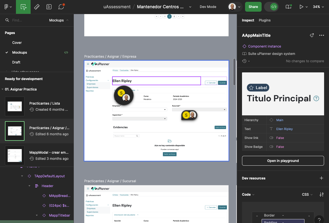
One of the major advantages of moving to Figma was the improved collaboration capabilities. We integrated our Figma files with tools like Jira and Slack to streamline the design handoff process. Designers, developers, and stakeholders could now access the same Figma files, view updates in real time, and provide feedback directly within the design environment.
4. Testing and Iteration
Feedback is always collected and used to refine the system, ensuring that it met the needs of all stakeholders. We also maintain a living document of design guidelines to accompany our Figma component library, which helps ensure consistency across teams.
Results
The implementation of a component system in Figma based on Atomic Design resulted in significant improvements:
- Consistency: Our digital products now have a cohesive look and feel, with consistent design patterns applied across the board.
- Efficiency: Designers no longer need to recreate elements from scratch, leading to faster design cycles and more time for innovation.
- Scalability: The modular nature of the Atomic Design system allows us to easily scale our design efforts, adding new components or modifying existing ones without disrupting the entire system.
- Improved Collaboration: Figma’s collaborative features enabled seamless communication between designers and developers, reducing the friction in the design-to-development handoff process.
Conclusion
Transitioning from bespoke UIs in Adobe XD to a component system in Figma was a game-changer for company. By adopting Atomic Design principles, we created a scalable and efficient design system that ensures consistency across our products while enabling our team to collaborate more effectively.